
 This page provides the latest online Help information for
gbDesigner,
a freeware visual designer for PowerBASIC programmers.
This page provides the latest online Help information for
gbDesigner,
a freeware visual designer for PowerBASIC programmers.
 Overview
Installation
Drawing Approach
File Support
CodeBox
Overview
Installation
Drawing Approach
File Support
CodeBox |
Code Generation
Context Menus
Toolbars
Special Commands
Issues/Road Map
Programmer Information |
For easier browsing, I've put the entire Help content into this single page. That makes for a long page, but I find that it supports searching and browsing more conveniently than moving between multiple web pages.
Overview
gbDesigner provides the tools for creating a dialog that contains any of the
controls supported by PowerBASIC. Control creation is accomplished by drawing
the control with the mouse.
gbDesigner also generates the source code necessary to recreate the dialog. The code can be placed on the clipboard, saved to a file, or directly inserted into your default *.bas file editor (such as the PowerBASIC IDE).
gbDesigner's simplest interface contains nothing but the caption and the drawing area. The user draws controls on the dialog using a mouse, with context menu options available to provide various tools, features, and settings.

However, there are additional GUI elements which provide the user with additional capabilities. The full list of gbDesigner GUI elements, and their usage, are:
The following image shows gbDesigner with the toolbar and CodeBox visible. Display of the toolbar and CodeBox is optional.

This next image shows that a floating toolbar may be used instead of the top-of-dialog toolbar. Or, the user can choose to use a floating toolbar.

The second (overlay) dialog is positioned directly over, and sized to match, the client area of the main dialog. When drawing actions take place (draw/drag/resize) rectangles of 4 types are drawn on the overlay dialog. Following a drawing action, controls are created/modified and placed directly on the client area of the main dialog.
The following image shows the concept (sorry for the hand-drawn image - working on something better):
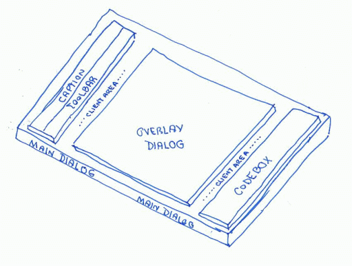
The drawing actions create one of the following rectangle types, drawn on the surface of the overlay dialog.
Controls which are created or modified as a result of drawing actions are placed on the main dialog - beneath the overlay dialog.
The overlay dialog is partially transparent, allowing the controls to be seen.
gbDesigner files use a custom binary format with an extension of *.gbd. See the section below on Programmer Information for more details.
The file commands, listed next, are available from the toolbars and from the drawing area context menu.
An additional command, Restore, is available from the context menu. It re-reads the current file and discards all changes made since the file was opened.
gbDesigner can be set to automatically save the current design on exit.
Display of the CodeBox is optional. The dialog height is automatically resized to accommodate whether or not the CodeBox is displayed. As controls are added to the dialog, the content of the CodeBox is automatically updated, and scrolled to the last line (where new control code is added).
The CodeBox has a context menu of it's own, containing the following options:
The code generated by gbDesigner is defined by two code file templates - gbdesigner_dialogcode.txt and gbdesigner_controlcode.txt. These file are read in at program start. As controls are added, the content of the files is used to generate the final code that is presented to the user.
Control Code Template
The template for standard and expanded control code is contained in the file
gbdesigner_controlcode.txt. Here's an example of the code provided for each of
the controls types:
::::ComboBox
    Control Add ComboBox, hDlg, cID, , x,y,w,h, _
        %CBS_DropDown Or %CBS_Sort Or %WS_TabStop,%WS_Ex_Left Or %WS_Ex_ClientEdge
    Control Add ComboBox, hDlg, cID, , x,y,w,h, _
        %CBS_DropDown Or %CBS_Sort Or %WS_TabStop,%WS_Ex_Left Or %WS_Ex_ClientEdge
    ComboBox Insert hDlg, cID, 1, "one"
    ComboBox Insert hDlg, cID, 2, "two"
    ComboBox Insert hDlg, cID, 3, "three"
    ComboBox Select hDlg, cID, 1
The first line is always the standard code . All remaining code lines define the expanded code. Each control type has its own area in the file, each area separated by "::::ControlName" at the start of a line.
The following phrases are replaced by gbDesigner with the indicated code:
The user is allowed to edit the control code template file.
A future version of gbDesigner will allow the user to edit control properties, including the style and extended style properties.
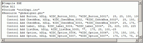
Dialog Code Template
The dialog code is created based on the following template. gbDesigner reads
the template (gbdesigner_dialogcode.txt) and replaces content based on the design
created by the user.
      #Compile Exe
      #Dim All
      #Include "Win32API.inc"

      'gb_equates

      Global hDlg as Dword
      'gb_globals

      Function PBMain() As Long
         Dialog New Pixels, 0, "Test Code",x,y,w,h, %WS_OverlappedWindow To hDlg
         CreateControls
         Dialog Show Modal hDlg Call DlgProc
      End Function

      CallBack Function DlgProc() As Long
         Select Case Cb.Msg
            Case %WM_InitDialog
      'gb_initialize
            Case %WM_Command
      'gb_command
            Case %WM_Notify
      'gb_notify
         End Select
      End Function

      Sub CreateControls
      'gb_controls
      End Sub
The following phrases are replaced by gbDesigner with the indicated code:

Here is additional information on each of the menu items.
| Design Mode Selection | Displays the secondand (right-side) context menu |
| Undo Delete | Deletes the last added control |
| Select | Used to select controls by drawing a rectange around them |
| Button thru TreeView | Selects the type of control that will be drawn |
| Select All | Selects all controls |
| UnSelect All | Unselects all controls |
| Delete Selected Controls | Deletes all selected controls |
| Delete All Controls | Deletes all controls in the current design |
| Show Code (Notepad) | Put the current source code in a temporary file and opens the file in Notepad |
| Copy Code | Copies the source code onto the clipboard |
| Capture Dialog | Captures the client area of the main dialog when in View mode. |
| Enable Design Mode | Enables the user to create/modify the current design (Overlay dialog active) |
| Enable Line Mode | Disables design changes by hiding the Overlay dialog. This enables the user to have direct access to the controls on the Main dialog. |
| Display Toolbar | Enables the display of a toolbar - either standard or floating, depending on the user's selection |
| Display CodeBox | Toggles display of the CodeBox. The Main dialog will grow/shrink with addition/removal of the CodeBox |
| Snap To Grid | Causes all drawing actions to use on-grid dimensions. |
| Show Grid | Displays the drawing grid |
| Confirm Delete All | Asks the user for confirmation for actions which remove all controls in the current design |
| AutoSave/Restore | Automatically save s(no user interaction) the current design when gbDesigner closes. Design is saved under the current file name. |
| Use Expanded Code | Toggles between use of the simple (Control Add statements only) and expanded code. |
| Floating Toolbar | Displays the floating toolbar (standard toolbar not shown) |
| SDK Code | Toggles between generation of DDT and SDK code |
| AutoCopy Code on Exit | Automatically copies the source code to the clipboard when gbDesigner exits |
| Line Mode Labels | Enables the display of a label within the Line Mode rectangles which represent controls |
| Set Snap Grid Size | Allows user to change the snap grid size. This grid size is the one used to determine controls size when snap-to-grid is enabled. |
| Set Display Grid Size | Allows user to change the size of the displayed grid. It does not have to be the same size as the snap grid size. |
| Set Z-Order | Opens a dialogs that lists all controls, allowing the user to arrange (by dragging), the z-order of all controls. |
| One Time Grid Alignment | Aligns all existing control dimensions to the nearest grid point |
| New | Opens a new, empty design named "temp.gbd", overriding any existing file of the same name |
| Open | Displays the "Open" file dialog |
| Save | Saves the current design without user interaction |
| SaveAs | Displays the "Save As" file dialog |
| Restore | Re-reads the current design from disk, without user interaction |
| Online Help | Opens the default browser to the gbDesigner online Help page. |
Both the dialog and floating toolbars provide the same options. However, the dialog toolbar additionally has the option to hie all buttons except those which deal with selecting a button to draw.
The drawing area context menu has all of the options of a toolbar, plus some additional options not available through the toolbars.
This is the image of the full width dialog toolbar

The left side of the toolbar (to the left of the Select button) can be hidden to minimize the dialog width needed to display the toolbar.
Here are separate images of the left and right sides of the toolbar:
Left Side:

Right Side:

A description of the functions provided by each of the toolbar buttons is given below, starting with the left side buttons.

| Toolbar Width | Toggles display of the 1st half of the dialog toolbar (this icon is always displayed) |

| New | Opens an empty design as "temp.gbd" |

| Open | Displays the "Open File" dialog for selecting a gbDesigner file. |

| Save | Saves all changes (uses current file name, no Save As dialog) |

| SaveAs | Displays the "Save As" dialog for selecting a file name underw which to save the current design. |

| Design Mode | Toggles between Design and View modes. |

| Line Mode | Toggles between Control mode and Line mode. |

| Delete All Controls | Removes all controls from the current design. |

| Undo (Delete Last Control) | Removes the last control that was added to the design. |

| Bring To Top | Brings selected control to top of Z-Order |

| Copy Code | Copies the current source code to the clipboard. |

| Display CodeBox | Toggles display of the CodeBox |

| Show Code (Notepad) | Saves source code to a temporary files, opens that file in Notepad. |
This next group of icons represents the toolbar buttons used to select controls for drawing. These icons are always displayed as part of the dialog toolbar.

| Select |

| Button |

| Check3State |

| CheckBox |

| ComboBox |

| Frame |

| Graphic Control |

| Image |

| ImageX |

| ImgButton |

| ImgButtonX |

| Label |

| Line |

| ListBox |

| ListView |

| Option |

| ProgressBar |

| Horizontal Scrollbar |

| Vertical Scrollbar |

| StatusBar |

| TAB |

| TextBox |

| Toolbar |

| TreeView |
Here's my map for additional features/changes for gbDesigner.
Ver 1.1
Ver 1.2
... in work
