 gbFloorPlanner
 gbFloorPlanner is an easy to use tool for creating layouts of any kind - house floor plans,
garden areas, party decorations, etc.. If the task involves figuring out how to place items in an area,
gbFloorPlanner is the tool for the job!
Using a simple set of drawing tools, library images and floor plan templates, you can create a
custom floor plan in just a few minutes. And while easy to use, gbFloorPlanner provides features
comparable to existing commercial and online floor planning applications.
gbFloorPlanner is an easy to use tool for creating layouts of any kind - house floor plans,
garden areas, party decorations, etc.. If the task involves figuring out how to place items in an area,
gbFloorPlanner is the tool for the job!
Using a simple set of drawing tools, library images and floor plan templates, you can create a
custom floor plan in just a few minutes. And while easy to use, gbFloorPlanner provides features
comparable to existing commercial and online floor planning applications.
The next few screenshots show various ways in which gbFloorPlanner can be used to create layouts.
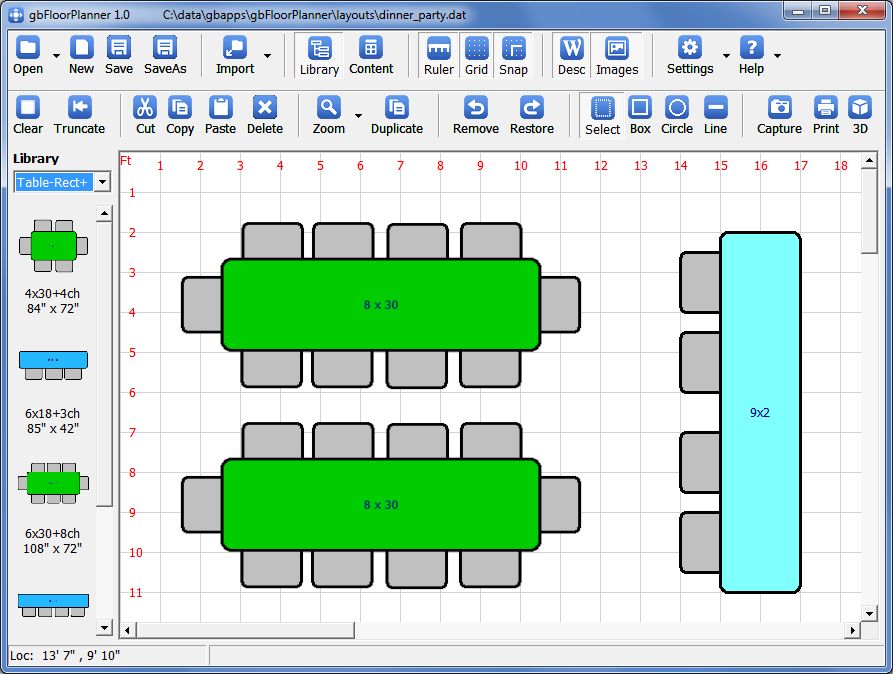
This first screenshot shows a layout consisting of tables, chairs, and a bar - such as
might be in a small party. Simple block symbols and colors are used to represent the items in the layout.
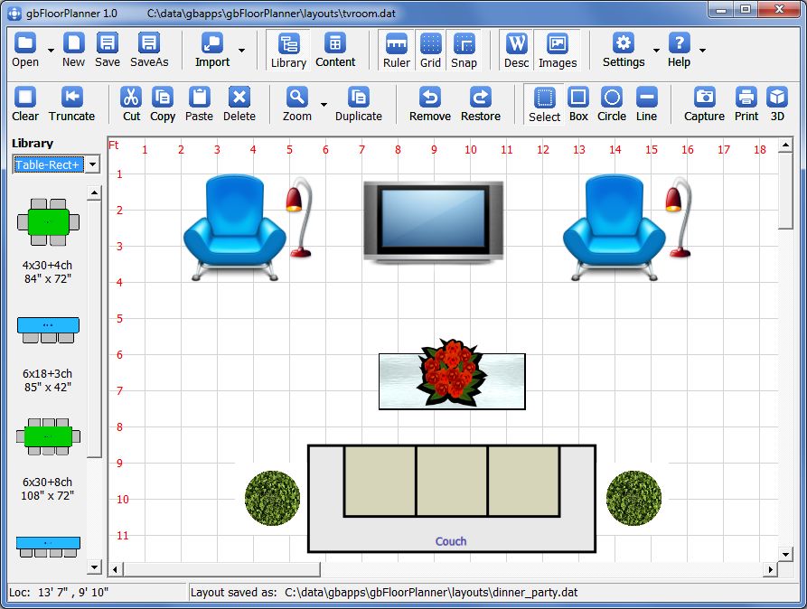
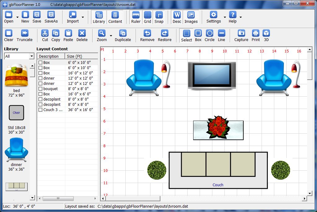
In this next screenshot, images of the items in the layout are used for visual enhancement.
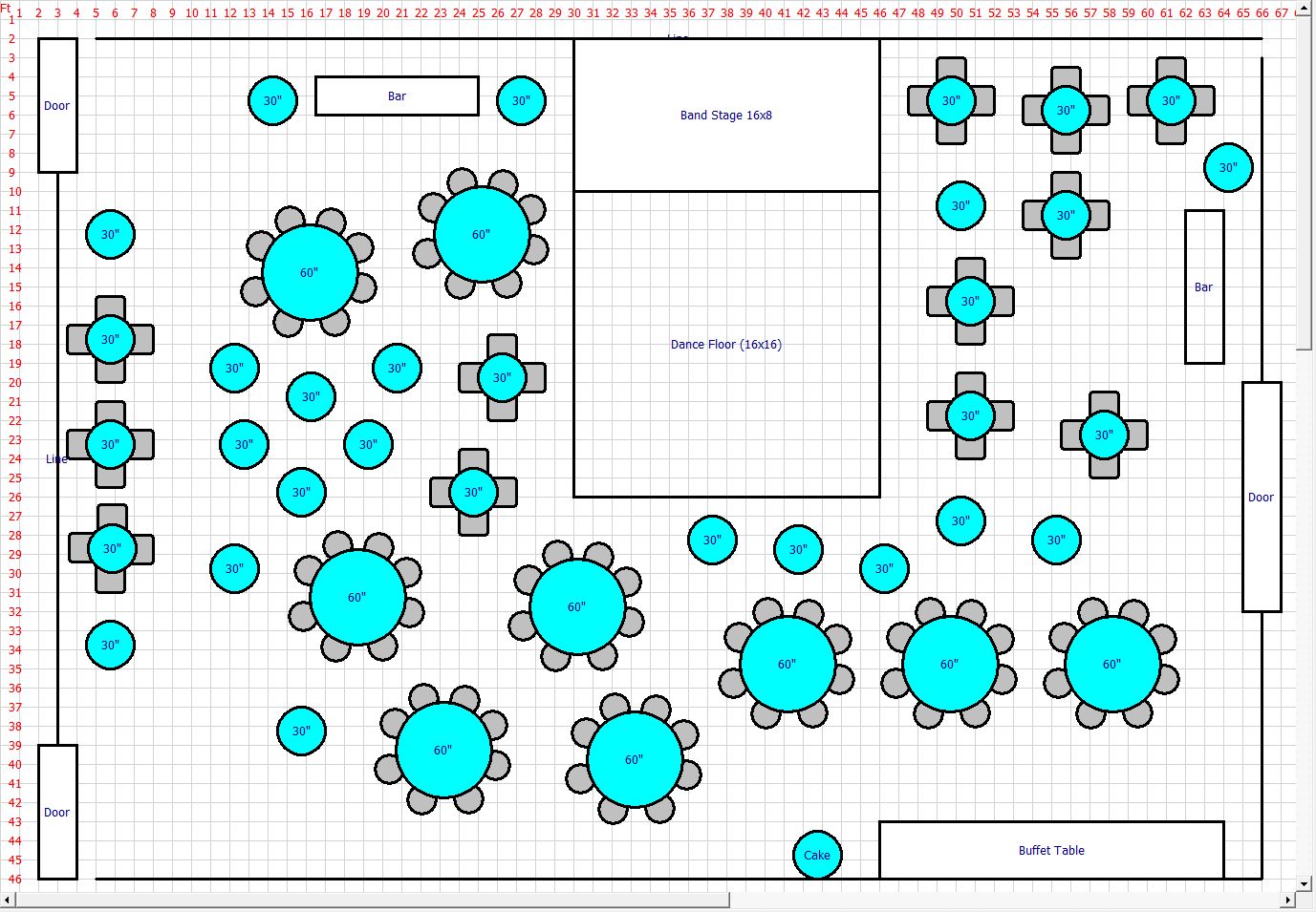
And in this screenshot, a more complex layout is demonstrated (potential layout for a wedding
reception).
gbFloorPlanner uses a single main window, consisting of two toolbars and a layout area where the
current floor plan is displayed. Two optional display features are available - a Library and a Layout
Content listing. In the fist two screenshots above, the Library is shown. The Layout Content listing
is discussed further down this page.
Feature List
gbFloorPlanner provides a complete selection of features for creating and editing floor play layouts.
- Create layouts quickly using only a mouse
- Save/restore layout sessions (return to where quit last session)
- Save/Open layouts to file
- Save Selected items to file
- Rectangle/ellipse/line drawing shapes
- Control of Layout item properties (Borders, colors, fill styles, images, ...)
- Resize items using mouse
- Import saved layouts/templates into current layout
- Image Library - items which may be easily added to layout
- Add your own images to the Image Library
- Layout Content Listing - all items in current layout
- Layout Summary Report - summary of unique items in current layout
- Cut/Copy/Paste items in the layout
- Undo/Redo (maintained in saved file and across sessions)
- Groups (multiple items treated as one)
- Select/move/delete multiple items
- Duplicate selected items
- Place items in front/behind other items
- Rotate rectangle and line items
- Control position of description with item boundary
- Border, Text, Background Color and Fillstyle properties for each item
- Pixel or Inch measurements
- OnScreen ruler
- Grids (dots or lines)
- 4 Zoom Factors
- Snap To Grid (or half-grid)
- Copy layout image to clipboard
- Print layout image (portrait/horizontal)
- Online Help (this page)
Features in work include onscreen resize, item rotation, save selections to Image Library,
semi-circle shapes, symbols and additional layout editing tools.
Using gbFloorPlanner
Creating a floor plan consists of just two simple steps.
- Draw Items - create layout items, which may be drawn as rectangles, ellipses, or lines
- Edit Properties - text, images, colors, and fillstyles may be edited for each layout item
Those two steps alone are sufficient to easily and quickly create a wide range of floor plans.
For additional, colorful visual content and to quickly create more complicated floor plans,
these two design features are provided
- Image Library - import your own images, pre-defining sizes and other properties
- Import Layouts - content of saved layouts may be added to the current layout design
Once items are placed in the floor plan, a number of editing capabilities are available
with which to fine-tune the layout and item properties.
- Select - draw a rectangle around items to select the items for subsequent actions
- Move - simply use the mouse to drag selected items to a new location
- Groups - multiple items may be grouped, so that user actions are taken against all items in a group
- Cut/Copy/Paste/Delete - standard editing features
- Duplicate - duplicate all selected items
- Send to Front/Back - place items in specified top-to-bottom order
- Zoom - get up close to the layout to inspect/fine-tune layout results
Many of the gbFloorPlanner features are optional, including the Image Library, Layout Content
Listing, the grid/ruler, and item text/image display,
Session Capture
When you close gbFloorPlanner, the current session is saved, then restored when you restart
gbFloorPlanner. If you have opened a gbFloorPlanner layout file, the "file changed" status will
be kept between sessions. You do not have to take any other action - just close and open, and
you'll be right back where you left off!
This feature is on by default. It can be turned off via the Setttings dropdown menu.
Library
One of the most powerful gbFloorPlanner features is the Library. A pre-defined library of
about 100 items, with exact dimensions and associated images, is provided with gbFloorPlanner. Just
double-click on a library item to insert the item in the layout.
The library items are categorized to make it easier to find a specific item. An "All" category
is also generated which contains all library items, making it easier to scan through available
library items.
Once a Library items is placed in the layout area, it cannot be resized. To do so would invalidate
the size information found in the library, making it difficult to know whether the available layout
area is sufficient to hold the total number of items in the layout.
Custom sized items, which can also have an associated image, can be drawn using the gbFloorPlanner
editing tools.
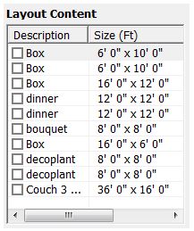
Layout Content
An optional list, "Layout Content", is available for display. It contains a line for each item
in the layout. Lines contain the description and size of the item.
Items which are selected in the Layout area will be checked in the Layout Content list. Likewise,
checking/unchecking an item in the Layout Content list will cause the corresponding item in the layout to be selected/unselected.
Double-clicking on an item in the Layout Content list, or in the Layout Area, will open a dialog for editing the item properties.
This next image shows gbFloorPlanner with the Layout Content list displayed.
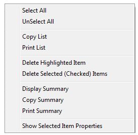
A context menu is also available from within the Layout Content list, with the following menu options:
- Select All
Selects/checks all items in the Layout Content list
- UnSelectAll
UnSelects/UnChecks all items in the Layout Content list
- Copy List
Copies the Layout Content list to the clipboard
- Print List
Prints the Layout Content list
- Display Summary
Displays a popup summary of the unique items/item count in the layout
- Copy Summary
Copies, to the clipboard, a summary of the unique items/item count in the layout
- Print Summary
Prints a summary of the unique items/item count in the layout
- Show Selected Item Properties
For the item selected (not checked) in the Layout Content list, displays a read-only popup dialog listing the item's properties.
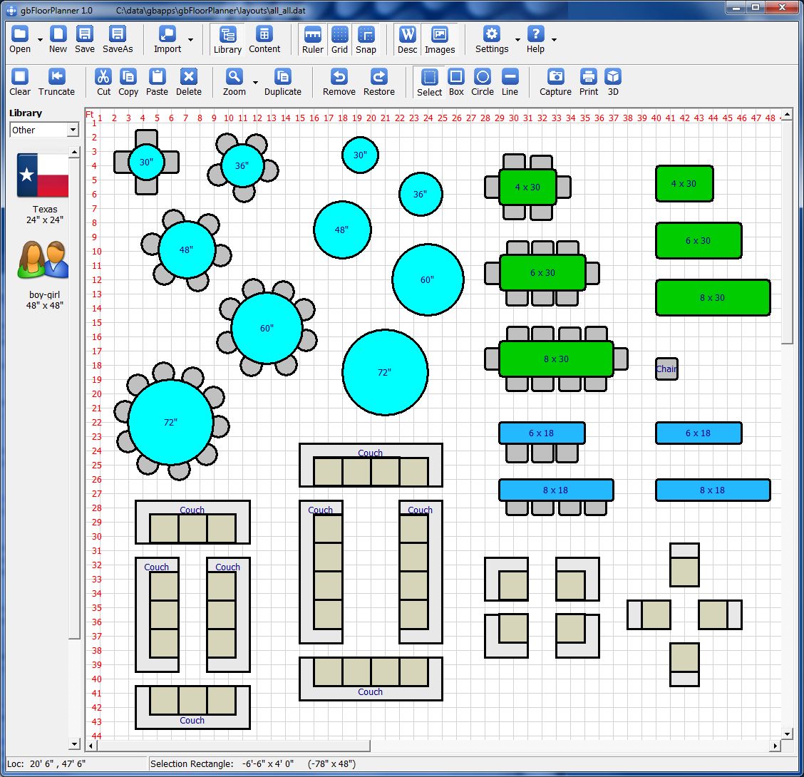
Pre-Existing Models
To speed the design of a layout that includes tables and chairs, gbFloorPlanner comes with
30+ models, shown in the next image, which can be added to your layout with the click of a mouse.
Models are available in two formats, Library items and gbFloorPlanner layouts.
Library Items
As noted before, library items consist of an image that is displayed at a specific size. When using
Library items in a layout (as opposed to custom drawn items), you can be accurately assess the size
of the floor needed to accommodate items placed in the layout area.
gbFloorPlanner Layouts
Each of the items in the image above are also available as a saved gbFloorPlanner Layout file. These
can be inserted into a layout area. The items (chairs/tables) within each layout have been "grouped" to
allow the user to work with the items as thought they were a single item. However, the grouped items can be ungrouped and the resulting individual items can then be edited/moved as desired.
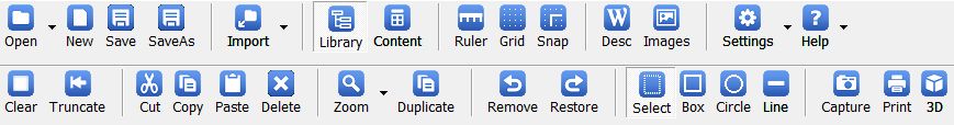
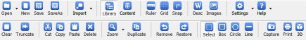
Toolbars
The gbFloorPlanner interface includes the following two toolbars.
Layout Settings (Top Toolbar)
The top Toolbar primarily provides file open/save options and various layout settings.

- Open
Opens a dialog for selecting a layout file to open in gbFloorPlanner.
The adjacent dropdown list lists all files in the "layouts" subfolder, providing an easier way
to select a file to open.
- New
Creates a new, empty layout. The user is first asked to save any changes
in the current layout.
- Save
Saves the current layout without asking the user for confirmation. Uses the
current filename.
- SaveAs
Opens dialog for specifying the name of file to save
- Import
Opens dialog for selecting a layout file to import. The dropdown
list provide an easier way to select a file to import.
- Library
Displays the Image Library (thumbnails of images available for insertion
into the layout)
- Content
Displays a listing of all items in the current layout
- Ruler
Displays a ruler along the top/left edges of the layout
- Grid
Displays a grid (dots or lines) in the layout area
- Snap
Constrains item placements and sizing to increments of the grid size
- Desc
Allows display of the text description of layout items
- Images
Allows display of the images associated with layout items
- Settings
When pressed, toggles display of the grid as dots or as lines.
The associated Settings dropdown menu provides the following menu options:
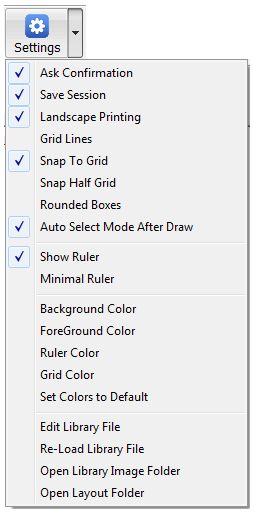
- Ask Confirmation
Before opening a new file, asks the user to save any changes made
to the current layout.
- Save Session
Enables saving work status between sessions. This is on by default.
- Landscape Printing
Enables landscape mode for printing the layout image
- Grid Lines
By default, grids are made up of dots. This menu item cause the grid
to be drawn as lines
- Snap To Grid
Enables forced placement of moved items at grid points. On by default
- Snap Half Grid
When Snap To Grid is on, allows snapping at half grid positions
- Rounded Boxes
Draw rectangles with rounded corners
- Auto Select Mode After Draw
After drawing a shape, go into Select mode
- Show Ruler
Displays a ruler along the left/top edges of the layout area
- Minimal Ruler
Reduces the number of numbers displayed in the ruler. In smaller
zoom factors, this makes for a cleaner layout area.
- Background Color
Sets the default background color, which is applied to all created
items
- Foreground Color
Sets the default foreground color, which is applied to all created
items (color of the border surrounding the items)
- Ruler Color
Opens a color dialog for selecting the color used to draw the ruler
- Grid Color
Opens a color dialog for selecting the color used to draw the grid
- Set Colors to Default
Sets all colors to the default values
- Edit Library File
Opens the Library file (in Notepad). After closing, you can see
the results in gbFloorPlanner by using the Re-Load Library File menu option or by restarting
gbFloorPlanner.
- Re-Load Library File
Refreshes the library information
- Open Library Image Folder
Opens Windows Explorer to the library image folder
- Open Layout File Folder
Opens Windows Explorer to the layout file subfolder
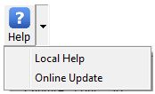
- Help
Opens the online Help page (this page). The Help dropdown menu provides the
following menu options:
Layout Editing (Bottom Toolbar)
The middle toolbar provides all actions for creating and modifying layout items.
- Clear
Removes all items from the layout
- Truncate
Removes all items from the Remove/Restore item stack
- Delete
Deletes selected items (placed on remove/restore stack)
- Zoom
Cycles between the 5 supported zoom factors
- Duplicate
Duplicates selected items (places them onscreen with a slight offset)
- Remove
Removes the last added layout item
- Restore
Restores the last removed layout item
- Select
Enters Select mode (draw a rectangle around items to select them)
- Box
Enters Box drawing mode
- Circle
Enters Circle drawing mode
- Line
Enters Line drawing mode
- Copy
Copies an image of the visible portion of the layout to the clipboard
- Print
Prints an image of the visible portion of the layout
- 3D
Displays a simplified 3D model of the layout
gbFloorPlanner Layout Context Menu
A context menu is available from the layout screen, and provides these menu items which act
on layout items:
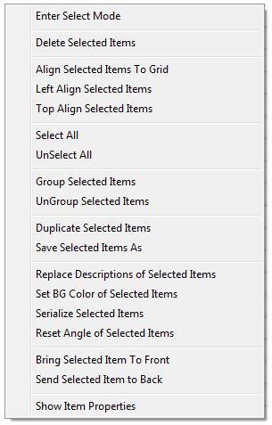
- Enter Select Mode
Allows use of the mouse to select items by drawing a rectangle around/through the items
- Delete Selected items
Deletes all selected items (placed on Restore list)
- Align Selected Item
Places the top/left corner of selected items at the nearest grid coordinates
- Left Align Selected Item
Align all seleted items with the leftmost selected item
- Top Align Selected Item
Align all selelcted items with the rightmost selected item
- Select All
Selects all items in the layout
- UnSelect All
UnSelects all items in the layout
- Group Selected Items
Places all selected items into a common group
- UnGroup Select Items
Removes all selected items from all groups
- Duplicate Selected Item
Places a copy if the selected items in the layout, slightly
offset in position from the currently selected items
- Save Selected Items As
Creates a Layout file containing only the selected items. The
current layout continues to contain the same file as before (not the newly saved file).
- Replace Descriptions of Selected Items
Opens an InputBox in which a specific
description, from within all selected items, can be replaced with a new text string (including a zero-length string)
- Set BG Color of Selected Items
Opens the color dialog for selecting a common
background color for all selected items
- Serialize Selected Items
Changes the description of each selected item to a number,
starting with 1 through however many items are selected.
- Reset Angle of Selected Items
Set the rotation angle of all selected items to zero
- Bring Selected Items to Front
Draws the selected items prior to all other layout items
- Send Selected Items to Back
Places the selected items at the back of the drawing order
- Show Item Properties
Opens a readonly dialog box which gives the properties of the
selected item
Keyboard Shortcuts
The following key combinations are available to the user to access gbFloorPlanner features:
- F1 - Help
- Ctrl-A - Select all items
- Ctrl-C - Copy Selected Items
- Ctrl-D - Duplicate selected items
- Ctrl-E - Clear (remove) all items
- Ctrl-F - Send selected items to front
- Ctrl-G - Align selected items to grid
- Ctrl-H - Opens InputBox for entering Z-value (height) of a layout item
- Ctrl-I - Capture next selection as *.BMP file. Places in the tempFile subfolder.
- Ctrl-L - List all items (in temp file, opened in Notepad)
- Ctrl-N - Sequentially number selected items
- Ctrl-P - Print layout image
- Ctrl-R - Toggle text orientation between vertical and horizontal
- Ctrl-S - Save layout as current filename with no user confirmation
- Ctrl-T - Toggle location of text within item boundary
- Ctrl-V - Paste
- Ctrl-W - Rotate item (rectangle/line) by 45 degrees counterclockwise
- Ctrl-X - Cut selected items
- Ctrl-Z - Remove most recently added item
- Del - Delete selected items
Other Comments
Miscellaneous information is provided in this section.
INI File
gbFloorPlanner application settings are saved in an INI file, kept in the same folder as the gbFloorPlanner application.
Comments and suggestions are welcome!
 Download (v1.02, 1.4M)